Canadian Politics
Mapping the results of the 2025 Canadian Federal Election
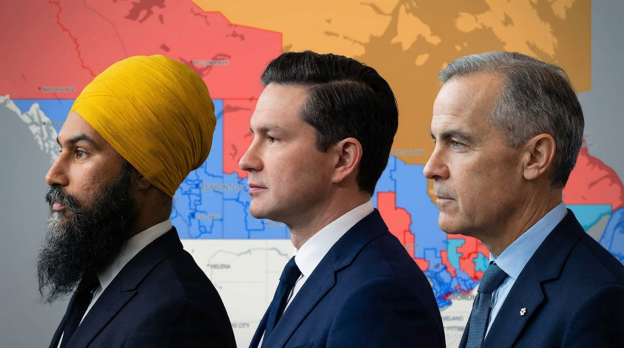
Yes, it’s finally here. I’ve generated the maps for the 2025 federal election wherein Mark Carney’s Liberal Party elected enough MPs to form a minority…
4 posts on Poll Maps from Stephen Taylor's archive of Canadian political commentary.
Yes, it’s finally here. I’ve generated the maps for the 2025 federal election wherein Mark Carney’s Liberal Party elected enough MPs to form a minority…

I just finished mapping out Doug Ford’s Progressive Conservative election win from 2022. On June 2 of that year, the voters of Ontario returned the PC leader…
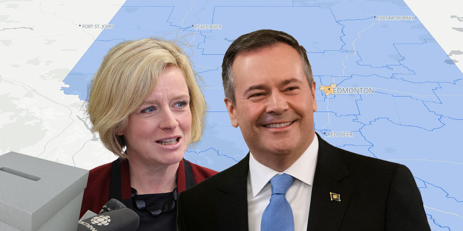
Map release day is always a good day. I’ve been griding away putting together a provincial map of the 2019 Alberta provincial election results. In this…
For the past week or so, when I’ve had a spare moment in the office, I’ve been working on a mapping project involving Elections Canada data and the Google…