Mark Carney's pick for Governor General is a 79-year-old Montreal jurist who endorsed a charter calling for the elimination of Zionism, led the UN's push to normalize mass migration, and told countries that objected…
Fifty-three employees. A $7.7 million budget. Zero examination reports in its most recent year. Three findings against a sitting Prime Minister and his Finance Minister that produced exactly zero institutional…
Carney's situation is not unprecedented. Every democracy that has faced it — Canada, the EU, Italy, the United States — has struggled with the same structural question. None have solved it.
Mark Carney was elected as the competent one. One year later, his deficits are twice Trudeau's, his housing numbers are a rounding error, and his sovereign wealth fund is backed by debt. His CV is doing a lot of heavy…
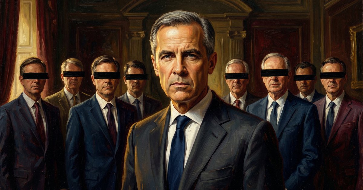
Brookfield Corporation has filed zero lobbying communications since Carney became Prime Minister. Its subsidiaries have filed twenty-three. The federal lobbying registry does not connect the dots automatically.
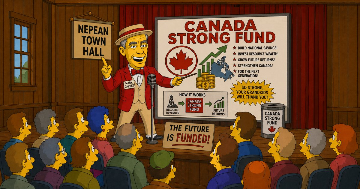
Every sovereign wealth fund in history was built on surplus revenue. Canada is running a $78 billion deficit. Carney's 'Canada Strong Fund' is borrowed money dressed up as national savings — and the comparison to Norway…
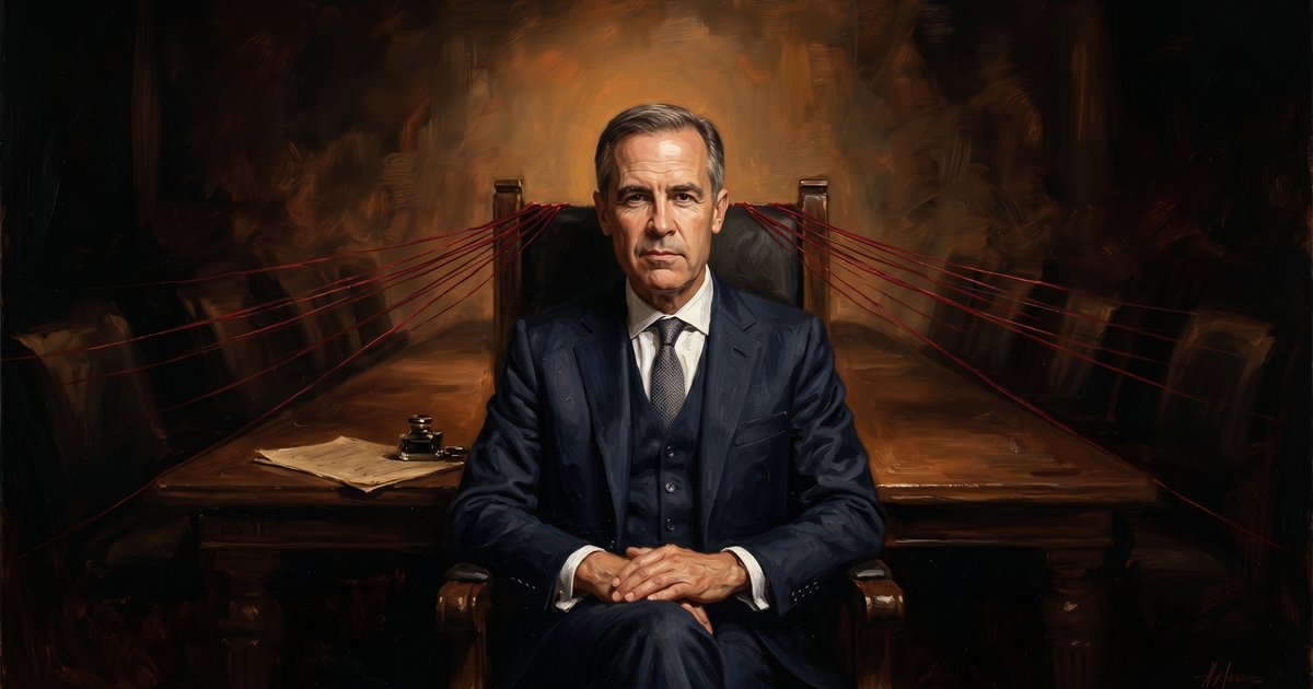
Most coverage of Mark Carney's conflict-of-interest arrangements is secondhand. This is what the actual document says — line by line — and what the law underneath it permits.
Non-binding parliamentary motions and UN declarations are expressions of values. They carry no force of law. But Canadian bureaucracies have treated them as signals to build programs, create offices, and spend billions…
Stephen Lewis has died at 88. Three generations of the Lewis family have shaped the Canadian left. His passing, days after his son Avi won the NDP leadership, marks the end of one chapter and the beginning of another.