Canadian Politics
Yikes! Patrick Brazeau faints in the Senate
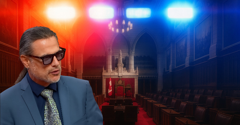
It appears that Former Conservative Senator Patrick Brazeau fainted in the Senate today as he rose to debate Prime Minister Mark Carney’s fast-tracked major…
Page 4 of 16 — posts in Canadian Politics.
It appears that Former Conservative Senator Patrick Brazeau fainted in the Senate today as he rose to debate Prime Minister Mark Carney’s fast-tracked major…

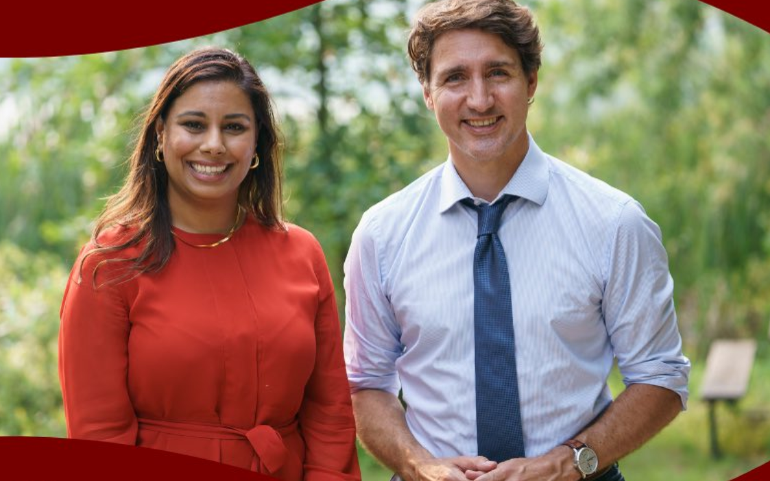
Battle River–Crowfoot MP Damien Kurek officially resigned from Parliament today. The move will trigger a by-election for the riding where Pierre Poilievre will…

In case you’ve been living under a rock – or locked up in a re-education centre – the Canadian political establishment has been rocked by revelations from both…
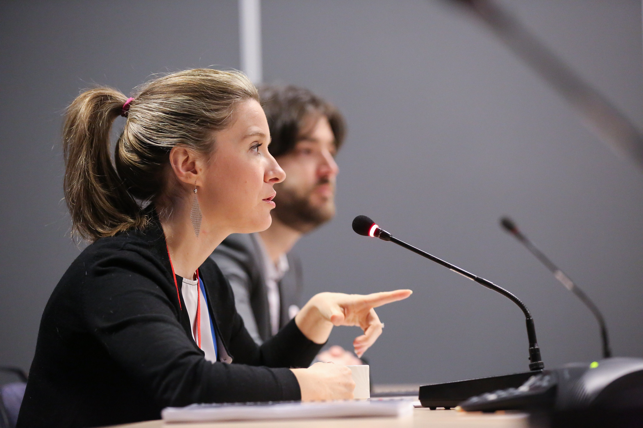
Today at the PROC committee, Liberal MP Ruby Sahota (Brampton North) complained about the hypothetical costs of a full public inquiry into the allegations of…
The slow grind of the story of alleged interference by Beijing’s communist government in Canadian elections continued this week. The Prime Minister announced…
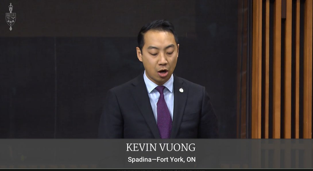
We don’t often hear from Independent MP Kevin Vuong. The Liberal Party of Canada disavowed Vuong as their candidate during the 2021 election in order to…
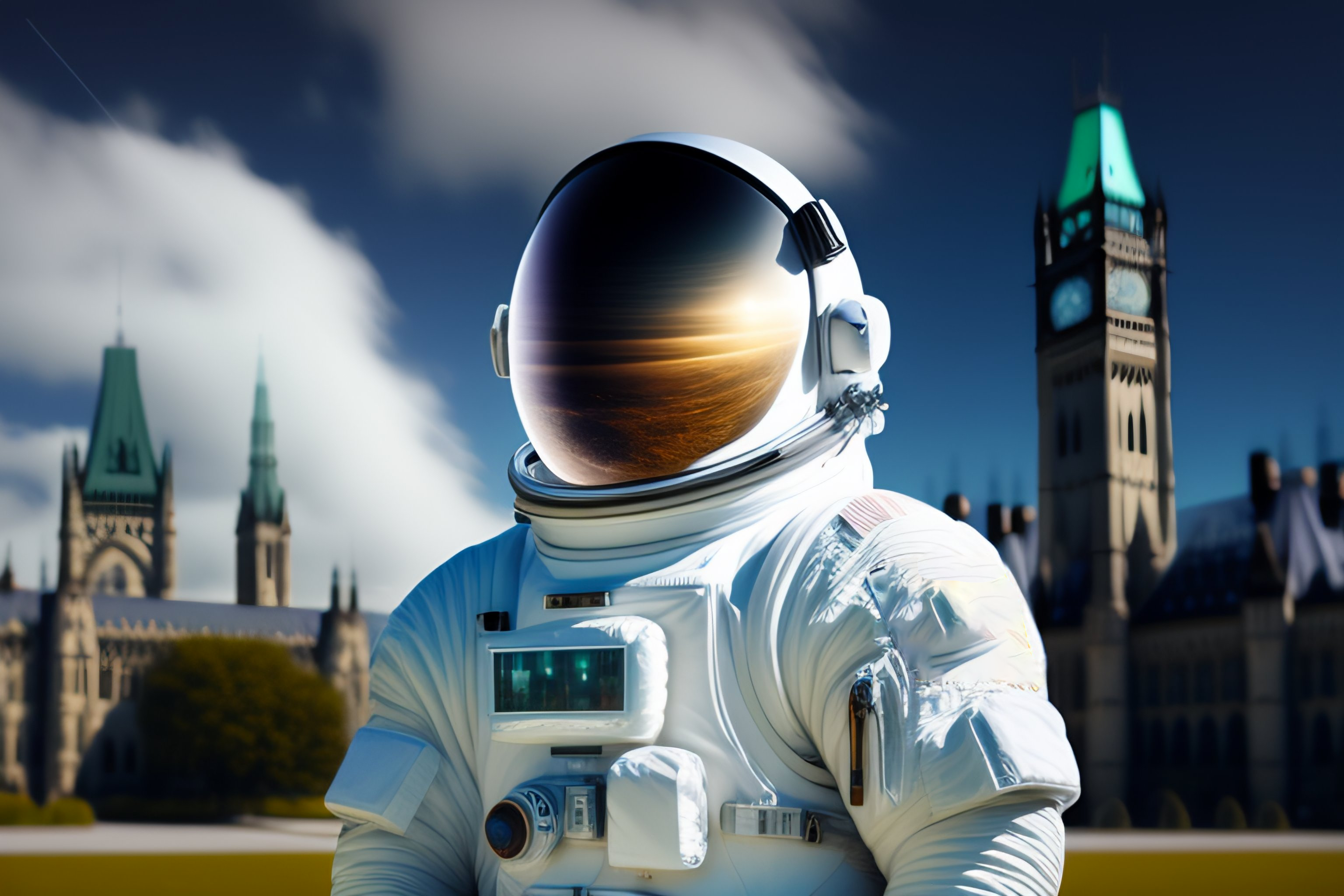
Marc Garneau is retiring from Parliament after almost 15 years. The Liberal MP marked his controlled descent onto terra firma in the House of Commons in 2008,…
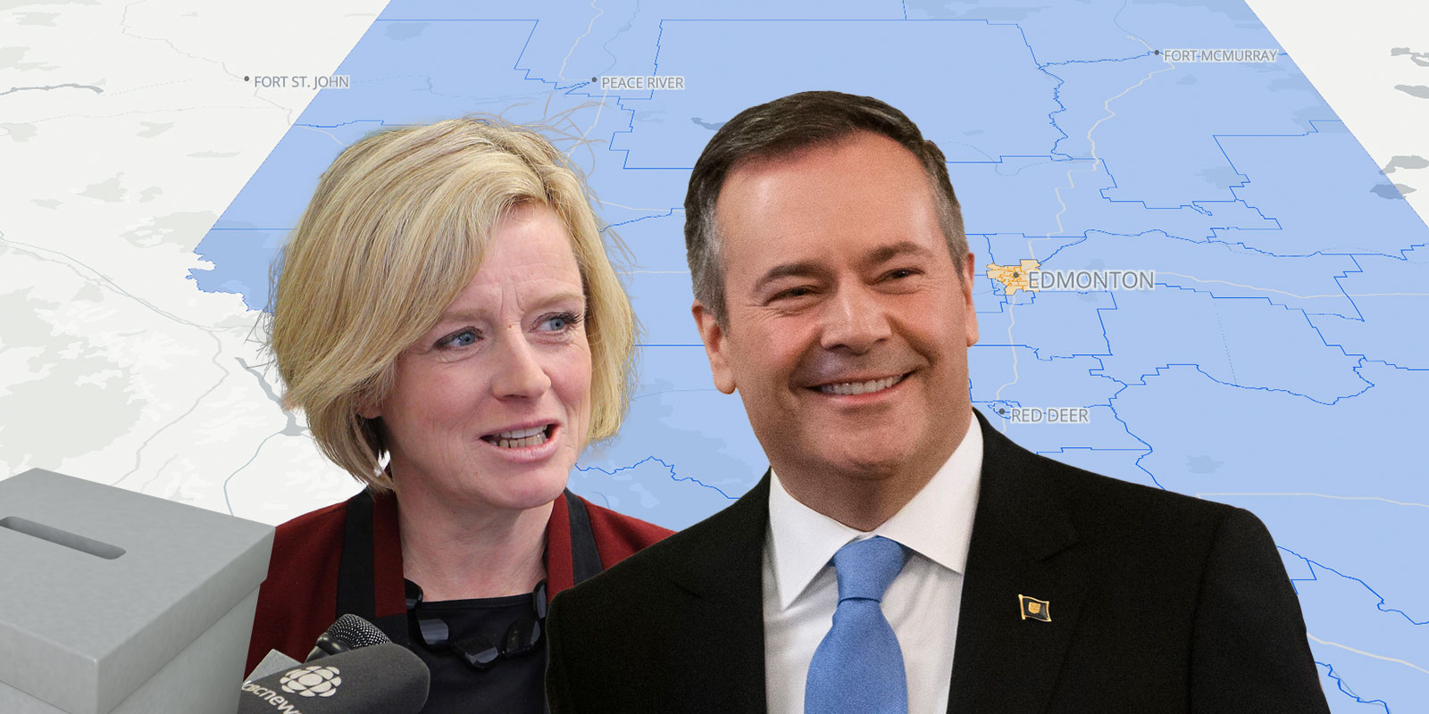
Map release day is always a good day. I’ve been griding away putting together a provincial map of the 2019 Alberta provincial election results. In this…

The second half of the Conservative Party leadership race is now underway. Midnight on June 4th represented the cut-off for new memberships sold for party…