Announcing GIS.tools!

I want to tell you about a new website I’ve made called GIS.tools.

Many of you may know that I enjoy making maps. Online maps. Maps that show us about our world and the data that defines it. I know that puts me in a bit of a rare category of nerdism, but I do enjoy creating them.

My political mapping project continues to gather interest and I often get complimented on it when I go to political conventions. It’s an easy way to find the other political map nerds who travel.

Yes, there’s maybe a couple of dozen of us in Canada – maybe it’s time to start a group chat?

Until then, I continue to scratch the itch and push new frontiers of learning. And that is this project that I’ve been working on with my AI co-workers.

What I’ve built is an extensive online tools website for map makers and I even landed it on GIS.tools.

Yes, that’s the domain name.

I always say the best name for a product is exactly what it is!

For those not in the know, GIS is Geographical Information Systems – the framework for capturing, managing, analyzing, and displaying all types of spatial or location-based data. People who make maps work in the field of GIS.

As you can imagine, there are lot of data in map making, and there’s a lot of file manipulation – often between different file standards from different eras. From Shapefiles, to KML, to GeoJSON – every map nerd has their preference.

Since I never paid for any expensive mapping software, or bothered to learn more than the basics of some of the free products, I’d keep finding myself googling specific online converters, calculators, and raster tools and finding them on a hodgepodge of various websites.

And sometimes the tools just weren’t out there.

So, I’ve been using AI to code these tools and collect them in one place.

I built a Swiss Army knife for map makers.

The result of that effort is GIS.tools.

It has more than 100 GIS tools. From Shapefile to GeoJSON converters, to GeoJSON validators, linters, and fixers, to Hillshade generators, the site probably has what you’re looking for.

And because we live in the current age, I also quite easily translated the website into six different languages. So, French, Spanish, German, Japanese, Korean, and Chinese mapmakers aren’t left out either.

So whether you need an EPSG Reprojector, a CRS Metadata Inspector, an MBTiles validator, or a Heatmap renderer, or are just learning about the tools of the trade, please do check out the site.

Most tools even have example data so you can get an idea of what they do!

You’re probably a fellow map nerd if you’ve read this far. And knowing my people, you probably have a website too. If you appreciate this sort of thing being out in the world for free, I’d appreciate a link so that others can discover it too!

Political maps and data for Canadian electors!

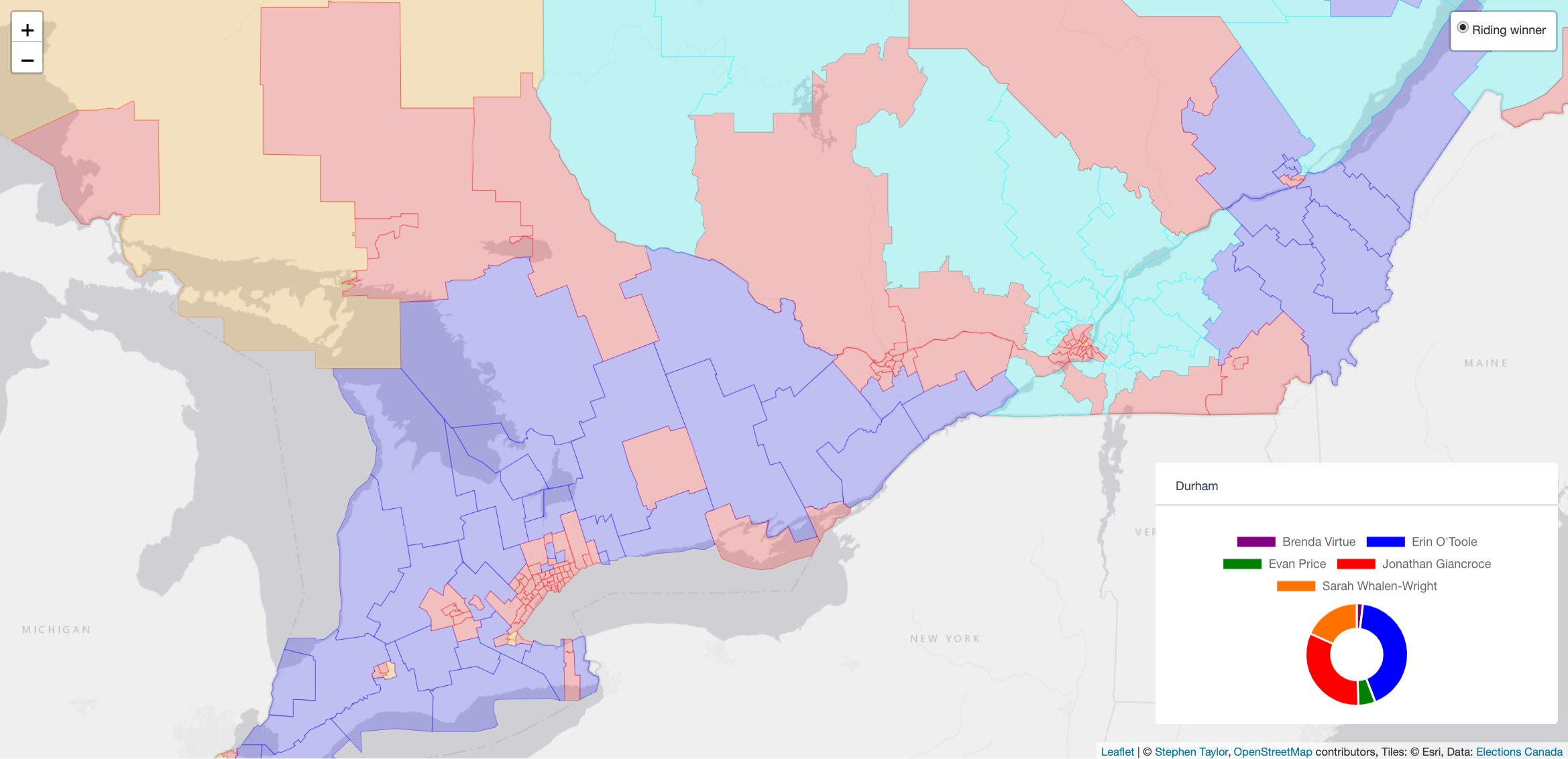
Here’s something that should give every political nerd hours of material to pore over. The Stephen Taylor Data Project is releasing some political maps, graphs, and census data for your consumption during this latest Canadian general election.

This efforts is the culmination of months of spare-time effort to package historical election results in an easy-to-digest format for Canadians during this 44th general election. You can browse every general election from 2019 back through the year 2000 (7 elections) and look at historical trends on each, with every riding map broken down by polling division.

Canada’s 43rd Parliament as elected in the 2019 General Election

Furthermore, you can create maps of each riding based on the relative strength of the party in each poll of each riding

If you’ve ever wanted to understand Liberal voting patterns, appreciate Conservative strongholds on a granular level, be facinated by the NDP’s local strategy, or track the Green Party’s and Bloc’s ebbs and flows, now you can! We’ve even got Alliance and PC results from the days of yore to bookend a re-emerging trend of some vote-splitting on the right that began again in 2019.

The riding of Burnaby South by polling division, after the 2015 general election

In 2000, Joe Clark led the PC Party prior to their merger with the Alliance. This map shows where he was strong (green) and weak (red) in Calgary Centre.

I’ve also combined data from the last census – perfectly segmented by riding – to give insights on what motivates voters. For example, income and affordability are top-of-mind issues for a lot of Canadians during this election. This project helps you consider these factors in each riding and compare these trends both nationally and provincially.

The population distributions of Desnethé–Missinippi–Churchill River (left) and Nanaimo–Ladysmith (right)
The differences between rental vs ownership in the riding of Spadina–Fort York (left) versus the province of Ontario as a whole (right)

I’ve also put up historical polling data that you can browse and I have a visualization demonstrating the rise, fall, and sustained dominance of Canada’s various political parties, as elected by voters to Canada’s federal Parliament.

A streamgraph visualization of Canada’s history of elections.

You can take a snapshot of each map by clicking the camera icon 📷 at the top of each geographic visualization. The images I’ve shared in this post were created this way. Go ahead and take snapshots of your favourite ridings (and favourite elections!) and share these images on social media. If you’re writing for a news outlet and you find any of this useful, please link to this post and to the Stephen Taylor Data Project! If you’re an avid twitter user, please tweet about this project.

So, please take a look and I hope that you enjoy! This work is being made available to general public and to every partisan of every party. I believe very strongly in a more representative democracy and believe that when more data becomes available and accessible that describes the shape of the Canadian vote, the more responsive our candidates can be in meeting that representation.

The riding of Nanaimo–Ladysmith in British Columbia, 2015 results

The project was coded using ReactJS, using both NoSQL (MongoDB) and relational (MySQL) databases to serve data through a common GraphQL layer facilitated by Apollo client on a Node.js server. Four gigabytes of GeoJSON files were constructed locally using some more of that server-side javascript magic. Those files are served via AWS S3, and are visualized for the end-user using the Leaflet library. Infographics SVGs are assembled using D3JS.