In anticipation for the defeat of the government back in May, both the Conservative Party of Canada and the NDP redesigned their respective websites into campaign websites. Both remain largely unchanged. Here, I offer advice to the Conservative Party of Canada to maximize their returns on their web campaign.
The splash page
This is the first page that greets visitors. It presents your immediate goals in a website, namely telling visitors that they’re at the correct website and setting the tone of the visit. If it is to be a splash page, it should not contain any superfluous information or complex navigation. The splash page is the boldest view that the visitor should receive when they visit the site because it’s the page that they will see most often. I’d like to comment on a few features.
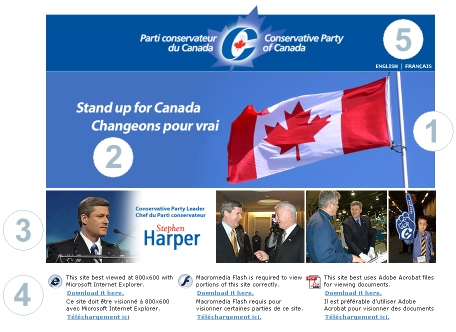
1. Bold blue used and Canadian flag image is prominent on the website. This is a very good image to greet Canadians. One should consider using flash to animate the flag slightly (without annoying the visitor).
2. I assume that this was intended to be the slogan for the election. It’s good to see that the party didn’t go with “Dump the corrupt Liberal bastards” or “No Dithering here”. The slogan must be positive, must underline the campaign on various issues “Stand up for healthcare”, “Stand up for accountability” etc. However, I do have one significant criticism: on the French language site at www.conservateur.ca, the French is still secondary to English. Do not make the French splash page a mere mirror of the English one. I’m not French Canadian, but I’ve always speculated that proud French-speaking people hate seeing French under English on all the signs in Ottawa.
3. Images of the Leader are good. In this country we seem think that we elect the leader of a party rather the individual MPs. Good job on including the Kennedy hair Harper and the laughing Harper. However, the images could be presented as an embedded flash slideshow with a 3 second fade delay. The use of a defining quote that underscores “Stand up for Canada” from the Leader would also be highly effective. “It’s time to stand up for what Canadians cherish, for our interests and for our national pride. It’s time to stand up for Canada — Stephen Harper”
4. This information is completely useless and should not be featured on this page at all. Virtually every computer user has Microsoft Internet Explorer and if they do not, the site looks just fine in Firefox or Opera. Besides, the golden rule of being a webmaster is that it’s your job make the website compatible across platforms, not demand that the user conforms to your preferences. Ninety-seven percent of internet users have Flash and most have Adobe Acrobat. Provide an acrobat download link in the documents section if you must.
5. This is the only method by which the visitor can enter the website, by the two small links in the top-right. It took me about 15 seconds to find out how to get to the next page, and I use the internet more than say Ethel and Edgar Conservative. Make the entry point to the website more obvious or those less interested in the party will close the window after 5 seconds.
UPDATE: Many visitors have commented that splash pages are in general, a bad idea. I’m inclined to agree. The critique above contains suggestions to improve the splash page, but the site on the whole would be better without the splash page.
The main site
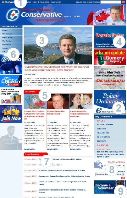
1. From the Conservative Party’s perspective of someone visiting the website, these are the most important things to the party. These are the “action items” of the website. However, they are hidden at the top of the website before the page really starts (the page starts at the logo). These items are vital to the success of the website. Analogously, it would be as if amazon.ca went out of its way to present information about their inventory yet added an obscurely place “purchase” link as an after-thought. For the most effective placement of the “action items”, check out the NDP website:
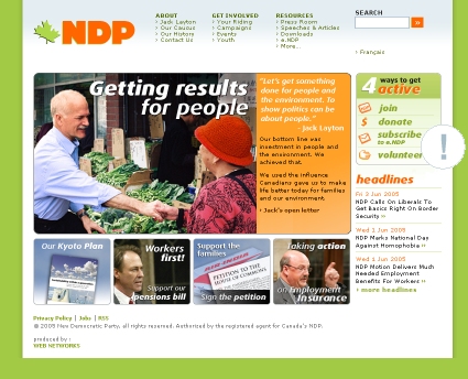
The “action items” are placed in the top right corner and are graphically stylized. For other examples, look at the campaign sites of George W. Bush and John Kerry:
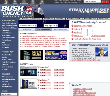
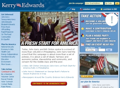
Again, the “action items” are well placed. Also the “action items” should be sequential and should present a step-by-step action plan for the visitor. 1. Join, 2. Donate, 3. Volunteer, 4. Write a letter to the editor, 5. Vote. Of course, this list will change based on the phase of the campaign.
2. The policy declaration! It’s now on the main page. Good job. However, on a standard screen resolution of 1024×768 it doesn’t appear on the first screen. This item is too important to scroll down to.
3. Large bold image of the Leader and the policy point being emphasized. This is an effective method of presenting the “ideas” part of a political website. I would make this part of the website more effective by presenting these items in a flash card type of way. Consider using Flash to make this flash card slideshow and use back/next controls. To any sucessful campaign there are sub-themes which mirror policy positions. This slideshow should feature bold images with related titles underneath such as “Standing up for cities”, “Standing up for healthcare” etc. People can either cycle through the sub-themes or click on the slide to find out more. Britain’s Labour party did something similar during their web campaign.
4. Good placement of donation link, however, as an “action item” as outlined in point #1, this link would be better placed among the others. The need for this image/link would thus be redundant.
5. Top stories. These items are what bring people back to the website. However, these items are located “below the fold” on the typical screen resolution.
6. The bulk of the website’s information is located through links in this menu. However, the image buttons in the left column and indeed those in the right-hand column make the site too “busy” and draw attention away from the main menu.
7. Press Releases. Yes, press releases are good, however, I’d like to emphasize the opportunity that the party has missed concerning this feature of their website. Look into getting this done as an RSS news feed. I’d sure like to integrate CPC press releases into my website automatically and I know about 125 other bloggers that would as well. Furthermore, those that don’t blog, have “news reader” programs which allow them to read releases as they become available. The NDP website has RSS available (and the Liberals do not). This is such an opportunity that so far has been significantly lost .
8. Find your riding. I’d like this feature to be more prominent as well. Check out what Britain’s Labour has done:
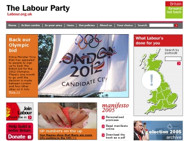
You can still use the feature as well at www.labour.org.uk
9. This is also be redundant as it could be featured instead as an “action item” in a highly prominent location on the page.
So, there you have it. Coming from a media-savvy consumer-conscious webmaster that’s been at it since ’95. I hope that some/all of these suggestions will be considered and if not, please give us RSS!
UPDATE: I forgot to mention that the website is in dire need of some <TITLE> tags. Perhaps then when people search for “Conservative Party of Canada” on Google, they won’t get turned off by a result titled “English | Français This site best viewed at 800×600 with Microsoft …”